Improve Windows Type Rendering With ttfautohint

In a stroke of genius, Wern­er Lem­berg has start­ed the ttfau­to­hint project, which repur­pos­es FreeType’s auto­hint­ing sys­tem to auto­mat­i­cal­ly hint True­Type fonts for improved Win­dows ren­der­ing. While no auto­hin­ter will be able to match the eye and skills of a man­u­al hin­ter, ttfau­to­hint pro­vides real world improve­ments, some­times dramatically.

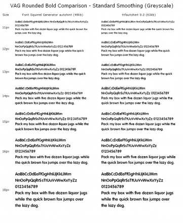
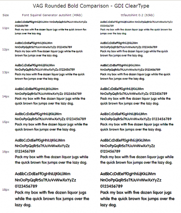
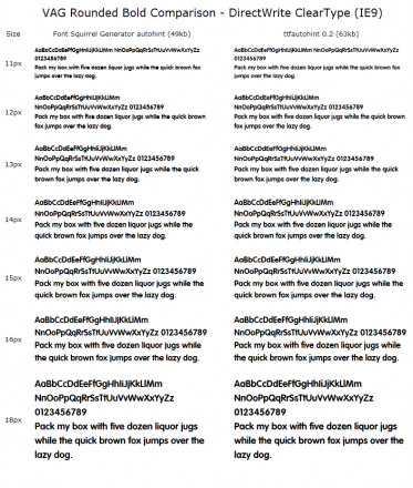
For exam­ple, I’m work­ing as a con­trac­tor on a project using the clas­sic VAG Round­ed font. 13px bold looks great in Pho­to­shop comps and Mac browsers, but fails hor­ri­bly under Win­dows. I decid­ed to run VAG Round­ed Bold through ttfau­to­hint 0.2 to see if it would offer improve­ments. In short: wow. In the screen­shots below, ttfau­to­hint goes head-to-head with the Fontsquir­rel gen­er­a­tor’s auto­hint­ing (which I believe is pow­ered by Font­Forge).

Ren­der­ing modes are shown in the cap­tions. Click for full size. (I’m restrict­ed to screen­shots because the font is only licensed for the client site.)

Stan­dard (grayscale)

GDI ClearType

DirectWrite ClearType

As you can see, there’s a dra­mat­ic improve­ment in all 3 Win­dows ren­der­ing envi­ron­ments. 11px-13px sizes move from awful, with com­plete­ly closed coun­ters, to supris­ing­ly read­able. At 14px, the coun­ters open up with stan­dard hint­ing, but clos­er inspec­tion reveals oth­er defects such as no sep­a­ra­tion between the body and dot of the i and j char­ac­ters. The improve­ments are even more dra­mat­ic under Stan­dard (grayscale) antialias­ing, which looks ter­ri­ble below 18px. Even under DirectWrite ClearType, ttfau­to­hint pro­duces supe­ri­or results (although a true test would also pro­vide a com­plete­ly unhint­ed ver­sion to see what the DirectWrite ras­ter­iz­er is capa­ble of on its own).

The only real down­side is a mod­est file size increase. I haven’t test­ed across mul­ti­ple fonts, but in this case our font jumped from 49kb to 63kb. I con­sid­er it an excel­lent trade-off for such improved rendering.

So, you want to use it? Well, first you should sup­port the project. Cur­rent­ly you need to com­pile ttfau­to­hint, but with our sup­port, Wern­er will build a GUI ver­sion for the com­mand line-pho­bic. If you’re on a Mac and want to com­pile, I put togeth­er an instal­la­tion script.

Edit: In an email exchange, Wern­er point­ed out that Dave Cross­land—who has done much of the ttfau­to­hint promotion—had the actu­al idea to use FreeType for hint­ing, although Wern­er still deserves mas­sive praise for the exe­cu­tion. Wern­er also point­ed out that VAG Round­ed is a good show­case font, and that ttfau­to­hint will not per­form such strik­ing results in all circumstances.

Better Google Fonts

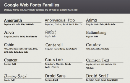
Google Web Fonts is an awe­some source of free, open source fonts hooked up to a world-class CDN. It’s also, sad­ly, filled with one-off nov­el­ty fonts vying for the title of “the new Com­ic Sans.”

I quick­ly dis­cov­ered that a good met­ric for high­er-qual­i­ty fonts was the pres­ence of at least one alter­nate. The Google Web Fonts direc­to­ry does not allow that type of fil­ter­ing, so I built this sim­ple one-off page that allows you to browse mul­ti-vari­ant type­faces. The lay­out is respon­sive, and click­ing the font name takes you to Google’s spec­i­men for that font.

All list­ed fonts are all down­loaded. It should go with­out say­ing that the page will load slowly.

Missed the link above? Go view Bet­ter Google Fonts. And, if you like code, it’s on GitHub for your fork­ing pleasure.

Environment Canada Mobile

The state of mobile weath­er apps isn’t awe­some. I find that it’s even worse in Cana­da, where weath­er data is sourced through non-Cana­di­an providers such as Yahoo (iOS’s built-in weath­er app) or AccuWeath­er, nei­ther of which I find tend to pro­vide very good Cana­di­an fore­cast data.

Envi­ron­ment Cana­da is my go-to fore­cast provider, but their site has been beat­en with the Cana­di­an gov­ern­men­t’s stan­dard web­site ugly stick. And, while a mobile site exists, it’s not much bet­ter. In fact, it’s worse in some ways.

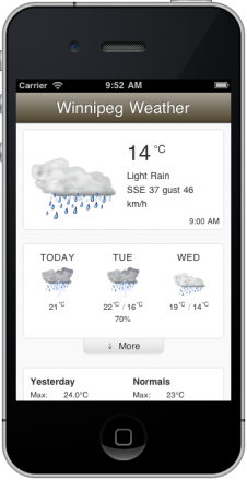
All of this has led me to make a mobile web app ver­sion. Or, at least, a mobile web app ver­sion for Win­nipeg, where I live. I scrape the HTML via a proxy and restyle it in a iOS-esque style. (I might get around to inte­grat­ing a city-switch­er, but that’s a lot of work and I built this for me and for fun.)

I opti­mized the design for two uses: 1) what are the cur­rent con­di­tions? and 2) what’s the imme­di­ate fore­cast? Most oth­er fore­cast data is hid­den by default, but can be shown. There are a few media queries for portrait/landscape view, and I snagged icons from the open-source Oxy­gen project to replace the drab ones from Envi­ron­ment Cana­da. It also makes use of HTML5 Appli­ca­tion Cache to speed up launch time. And, although it should work any­where, it’s been heav­i­ly opti­mized for iOS Safari.

View my Win­nipeg mobile weath­er app. The source is on GitHub, of course.

FontFriend 3.2 Released: Now With More Google

When I released Font­Friend 3.1, I men­tioned that Google Web Fonts didn’t have a prop­er API, mak­ing things dif­fi­cult. They still don’t have a pub­lic API, but on Thurs­day I was giv­en “trust­ed tester” access to the new API. It won’t look that much dif­fer­ent, but there’ll be a few fonts work­ing now that weren’t before (mul­ti-vari­ants like PT Sans and IM Fell).

I’ve start­ed using Font­Friend exten­sive­ly on my Soma Web Font Spec­i­men (or, if you like, on the orig­i­nal) as a great way to eval­u­ate Google Web Fonts, as the direc­to­ry looks like an app, not a web page (although v2 of the direc­to­ry looks awe­some). If you have Font­Friend installed already, you’re already up to date. If you don’t, go install it now!

Some Cranky WordPress Plugins

It looks like I may carve out a niche for cranky Word­Press plu­g­ins. This could either be seen as a per­son­al­i­ty flaw or as a per­fect fit with­in open-source cul­ture. In either case, Word­Press makes it easy for irri­ta­ble peo­ple to release plu­g­ins to change what they don’t like about it. I’ve done so twice recently.

Kill Adminbar Search

WP 3.1 intro­duced the admin bar, which is gen­er­al­ly quite use­ful. How­ev­er, because Word­Press’s search is gen­er­al­ly not use­ful, hav­ing the search field take up so much real estate is some­what frus­trat­ing. So, I made a plu­g­in to remove it. You can down­load Kill Admin­bar Search from the plu­g­ins repo.

Use Helvetica Dangit

WP 3.2 (cur­rent­ly in beta 2) has revamped the admin styles. It looks good, but we’ve made the griev­ous error of plac­ing Ari­al before Hel­veti­ca in the font stack, which I protest­ed. What we should do instead is sim­ply declare font-family: sans-serif; and be done with it: this would ren­der Hel­veti­ca Neue on Macs, Ari­al on Win­dows, and what­ev­er Hel­veti­ca-like default sys­tem sans-serif is set on any giv­en Lin­ux dis­tro. But, since my plu­g­in is option­al, I’ve declared every Hel­veti­ca vari­ant under the sun, because nobody should have to look at Ari­al if they don’t have to. Down­load Use Hel­veti­ca Dan­git from the plu­g­ins repo.