FontFriend 3.1 Loves Google Webfonts

I’ve had a num­ber of requests to bet­ter inte­grate Google Web­fonts into Font­Friend. They keep adding all these great fonts that any­one can use for free, and should be part of a tool like Font­Friend. The trou­ble was that they did­n’t have an API, mak­ing it dif­fi­cult. More on that lat­er, because I got it working:

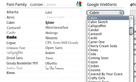
Just pick a font from the drop­down list

Invoke the book­marklet as usu­al (it’s always up to date), and you’ll see a fan­cy new Google Web­fonts drop­down. Pick a font and it’ll appear in the cus­tom Font Fam­i­lies list. All vari­ants (all weights, both roman & ital­ic) are auto­mat­i­cal­ly pulled in.

How was I able to do this with­out an API? YQL to the res­cue, which it turns out is awe­some for tasks like this. But, after post­ing a teas­er on Dribb­ble, Pablo Impal­lari hooked me up with the Google Web­fonts teams, who will have an API for this in place soon. I debat­ed wait­ing to release until then, but I’d already done the work, so why not let every­one play already?

One oth­er lit­tle nugget: Font­Friend will detect already-embed­ded Google Web­fonts on your page and throw them into the cus­tom fonts list auto­mat­i­cal­ly. See a demo of Google Web­font detec­tion.

Final­ly, after tweet­ing about it,  I’ve had rep­re­sen­ta­tives from a few web­font ser­vices reach out to me about bet­ter inte­gra­tion once they get their APIs in place. There should be more ways to play in the future!

FontFriend 3.0 Released

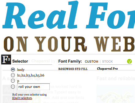
I’m pleased to announce the imme­di­ate release of Font­Friend 3.0, the Type­kit inte­gra­tion edi­tion. Invok­ing the book­marklet on any Type­kit-enabled page will automag­i­cal­ly throw all the fonts in your kit into the cus­tom fam­i­lies list. I’ve set up a demo page with Font­Friend embed­ded and a big Type­kit kit.

Typekit.com uses Rose­wood Fill and Chaparral

My main imag­ined use-case for this fea­ture is the design­er try­ing to test out a vari­ety of web­fonts on their page. I’d intro­duced cus­tom lists in Font­Friend 2.5, but they did­n’t play well with Type­kit, as I dis­cov­ered when redesign­ing my per­son­al blog. I’d hacked in a fea­ture for my own use, but was nev­er real­ly hap­py with it.

But then I remem­bered that Type­kit has an API.  They even have an exam­ple book­marklet that lists every font in your site’s kit, doing most of the work for me. A cou­ple of short week­end cod­ing ses­sions lat­er, the fea­ture was inte­grat­ed. Just acti­vate Font­Friend on a Type­kit-enabled page and you’ll see the Type­kit logo and your kit’s fonts in the cus­tom list. Check out the demo page to see this in action on a page with a big Type­kit kit.

But wait, there’s more! Font­Friend 3.0 also pop­u­lates your cus­tom font list with every @font-face-declared font fam­i­ly cur­rent­ly active on your page. See a demo. This only applies to rules declared in stylesheets on the same domain due to cross-domain secu­ri­ty restric­tions, which means that most third par­ty web­font ser­vices are left out in the cold.

Oth­er 3.0 features/changes:

  • Reor­ga­ni­za­tion of the mod­ules to bet­ter suit my imag­ined opti­mum workflow
  • Font weight is now a drop­down to give you numer­ic access to all weights
  • All drop­downs have arrow tog­gles beside them for speed­i­er chang­ing. (I dis­like the tedious “click, move mouse, click again” flow of drop­downs, so this should help.)
  • Drag and dropped @font-face fonts now get thrown in the cus­tom font fam­i­ly list
  • Drag and drop now uses the asyn­chro­nous Fil­eRead­er API, which should be much more per­for­mant, espe­cial­ly when drag­ging in mul­ti­ple font files at once. (Thanks to Ryan Sed­don for his work on Font­Dra­gr that showed me the way.)
  • The pre­vi­ous­ly miss­ing Font Style mod­ule is now includ­ed. Hel­lo italics.
  • Big reor­ga­ni­za­tion of the code. It’s still a bit squir­re­ly, but bet­ter orga­ni­za­tion will make it eas­i­er to add (good) fea­tures in the future.

I’d love to sup­port oth­er web­font ser­vices, but none of them have APIs that can do what I’ve done with the Type­kit API (or at least not that I’ve dis­cov­ered). Oth­er ser­vices: please let me know if/when that changes!

Web Typography Pain Points

When I launched mattwie.be, I said that I had some things to say about the state of CSS typo­graph­ic con­trols. I’m mak­ing good on that threat. Things have come a long way from too-long mea­sures of Times New Roman on a mid-gray back­ground, but CSS still lags behind page lay­out soft­ware in many areas, which is only com­pound­ed by incon­sis­tent brows­er implementation.

I’m going to espe­cial­ly focus on ::first-line and ::first-letter pseu­do-ele­ments which, to my sur­prise, WebKit has some mas­sive prob­lems with. Specifically:

  • WebKit does not accept text-transform on the ::first-line pseu­do ele­ment. This embar­rass­ing bug is almost 6 years old and means that the com­mon typo­graph­ic prac­tice of set­ting the first line of a para­graph in all-caps is impos­si­ble in Safari, Chrome, and—insanely—iBooks, which uses WebKit for its ebook ren­der­ing. The clos­est you can get is font-variant: small-caps which would work fine if we could also use text-transform: lowercase, but we can’t.
  • WebKit also does­n’t accept a font-family rule in both the ::first-letter and ::first-line pseu­do-ele­ments. The lat­ter is usu­al­ly OK, but the for­mer real­ly sucks. Even worse, in both cas­es, a font-family rule will cause them to fall back to the sys­tem font!
  • WebKit has a bug where mod­i­fy­ing the DOM of an ele­ment that has a ::first-letter CSS rule attached will result in a phan­tom first let­ter. See QuirksMod­e’s test case. (Opera does this too.)

Fire­fox isn’t all ros­es either, despite their ter­rif­ic efforts in bring­ing long-await­ed Open­Type fea­tures into CSS. The main thing I noticed was that Fire­fox treats ::first-letter odd­ly style-wise. It does­n’t seem to behave as a full-fledged block-lev­el ele­ment when set­ting float or dis­play prop­er­ties. It also com­pounds the font-size when the ::first-letter coin­cides with anoth­er DOM ele­ment that also sets the font-size.

Some oth­er issues:

  • WebKit sets its pseu­do-small caps (when using font-variant: small-caps) small­er than oth­er browsers. It also seems to add some pseu­do-embold­en­ing to bet­ter com­pen­sate for the fact that they’re not true small caps.
  • Incon­sis­ten­cies between browsers in con­form­ing to the ::first-letter spec for includ­ing punc­tu­a­tion char­ac­ters. Specif­i­cal­ly, WebKit only seems to include punc­tu­a­tion that pre­cedes the let­ter, not punc­tu­a­tion after it.

I’ve cre­at­ed a test page that illus­trates a lot of these pain points. I also made a page that demon­strates a WebKit nor­mal­iza­tion strat­e­gy with some UA sniff­ing and the jQuery fan­cylet­ter plu­g­in, which I con­tributed a small patch to along the way. I’d describe that strat­e­gy, but then this post would nev­er be pub­lished. View source!

Redesign of mattwie.be

I just launched my redesign of my per­son­al blog mattwie.be (for­mer­ly mattwiebe.com) and I could­n’t be hap­pi­er to final­ly have it live. This is a full-cir­cle moment for me, as tweak­ing my blog (first on Blog­ger, lat­er on Word­Press) was what launched me into web devel­op­ment. After see­ing that I could pro­duce bet­ter code and design than most of what I was see­ing on the web, I thought I’d give it a go. 3 fun and busy years lat­er, my per­son­al blog has sat stag­nant in both con­tent and design.

Design Philosophy

I’m a big fan of design con­straints. For this project–just like my Word­Press theme The Eru­dite—the major design con­straint was “it’s all about the con­tent.” This meant say­ing good­bye to all the cruft of today’s blogs: side­bars, social media shar­ing links, ads, and all the junk that dis­tracts from read­ing the actu­al con­tent. I might rel­e­gate some typ­i­cal side­bar-type things to the foot­er (archive nav­i­ga­tion, search) but for now I’m real­ly enjoy­ing the minimalism.

Type & Typography

Web design is 95% typog­ra­phy, and this design push­es that to 99.9%. I’ve made use of Robert Slimbach’s excel­lent Min­ion Pro for body text, while head­lines are set in Car­ol Twombly and Slimbach’s Myr­i­ad Pro Con­densed. Both are served by the fine folks at Type­kit. I made exten­sive use of Tim Brown’s Mod­u­lar Scale tool for all dimen­sions, which is why the design (hope­ful­ly) feels nat­ur­al. My scale is 18px/15px, Musi­cal Fifths.

Also worth not­ing is that advanced web typog­ra­phy is still a land­mine of brows­er incon­sis­ten­cies and out­right bugs. I will be revis­it­ing some (painful) lessons learned in a future post.

Responsive Design

Respon­sive design is fun. Being able to pro­vide a sin­gle tem­plate that works on a vari­ety of devices and at dif­fer­ent screen widths has been the web design holy grail for years, and now we can do it. I tar­get­ed the iPad por­trait view (768px wide) as the ide­al view, as that’s how I enjoy read­ing the most these days. Browsers that don’t under­stand media queries will show this style. I adapt the style to vary­ing degrees for widths of < 1024px (wider screens), 431–649px (iPhone land­scape), and < 431px (iPhone por­trait). I think it turned out pret­ty well. My focus on con­tent made this process rel­a­tive­ly straightforward.

Post Counts

The only non-stan­dard design ele­ment I includ­ed was a post count. This is an attempt to game myself into post­ing more often. I’ve set myself the goal of reach­ing 500 posts by the end of the year, and I now have a con­stant visu­al reminder of my progress. We’ll see how suc­cess­ful this self-gam­i­fi­ca­tion design ele­ment is. Any­one who’d like to inte­grate this into their own Word­Press tem­plates can grab the code.

A Work in Progress

There’s still more to do. Archives and search need to be designed and exposed. I want a bet­ter expe­ri­ence for the home page; some­thing to describe myself and the site bet­ter to new vis­i­tors. If you have any suggestions/critiques, please sound off in the com­ments below!

The Definitive @font-face Syntax

UPDATE: The syn­tax has already been improved to favour IE9 load­ing WOFF instead of EOT, thanks to some sleuthing by the CSS Ninja.
UPDATE 2: The syn­tax now uses a ? instead of a # because local IE requests choked on the #.

Ethan Dun­ham of Font Squir­rel and Fontspring fame has just released the defin­i­tive @font-face syn­tax. I’ve been hyp­ing it up on my Twit­ter account, but this is too good to restrict to my fol­low­ers there. The new syn­tax is clean, beau­ti­ful, and sim­ple. It looks like:

@font-face {
   font-family: 'MyFontFamily';
   src: url('myfont-webfont.eot?') format('eot'),
        url('myfont-webfont.woff') format('woff'),
        url('myfont-webfont.ttf')  format('truetype'),
        url('myfont-webfont.svg#svgFontName') format('svg');
}

Here’s the mag­ic he found:

The hack trick that makes this work is the ‘?’ fol­low­ing the EOT file­name. Seriously.

Just awe­some. Great work Ethan!