I recently launched thatwasnotok.com, a humourous take on how to handle social un-graces. One of the fun parts of designing and building the site was the freedom to work with a font like Chunk without resorting to embedding it in images or using sIFR or Cufon. I showed it to Tim Brown from Nice Web Type, prompting a dialogue about some decisions I made in working with Chunk, which Tim later published. (Incidentally, if you’re curious about how to embed fonts in a web page, Tim’s How to use CSS @font-face is your best starting point.)
But what I really want to talk about was one of the questions Tim asked me but chose not to publish on his site, which was:
So about the missing characters in Chunk. What if you didn’t have an alternative (like if you needed an ampersand)? Would you substitute one from another typeface? Which typeface?
After mentioning that I didn’t much care about the missing glyphs for such a small site as mine, I went on to say:
For a font with glyphs missing, you fall back in your CSS stack to the next font that has the glyph. This is the premise that Typekit works on when it splits fonts into two pieces and then puts something like
font-family: skolar-1, skolar-2, serif;in its CSS rules. If I had found a complimentary typeface (with appropriate licensing) and wanted it just for the glyphs that Chunk was missing, I could make a small, subsetted version of it (remove all the glyphs that Chunk already has), embed it as well with @font-face and put it after Chunk in the font stack.
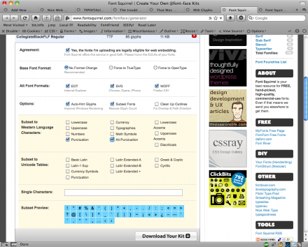
After my chat with Tim, I became a little fixated on trying to find just such a suitable subsetted fallback. I went over to Font Squirrel and came up with two possible free replacements: CollegiateFLF Black and Bender Black. After downloading, I re-uploaded them through Font Squirrel’s marvelous @font-face Generator in order to subset the fonts down to only glyphs that aren’t already in Chunk (more or less). Subsetting only the glyphs you need can create dramatically smaller font files, speeding up your site. I chose to only include Punctuation and Alt Punctuation, as shown in the image below (click for larger):
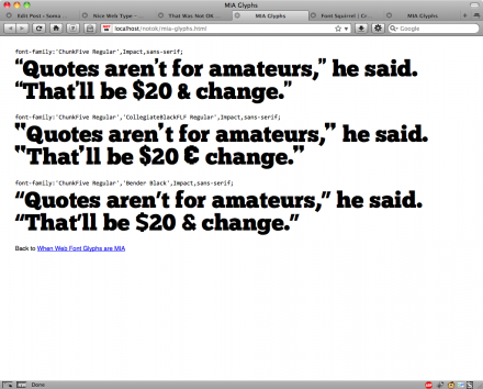
So, what did it look like? Not that great unfortunately. Chunk is just far too unique to play well with (freely available) others. I tried three different stacks, falling back to either 1) Impact, 2) Collegiate Black and 3) Bender Black. Have a look: MIA Glyphs, or just see the image below.
I think that Collegiate Black comes the closest, but its dollar sign and ampersand are a terrible match for Chunk. Bender is entirely ill-suited, and Impact isn’t much better. None of the apostrophes look similar to Chunk’s comma, which is what I would hope to see in a well-suited fallback.
The closest I came to being happy was with Impact as a fallback for apostrophes (the only glyph I needed that Chunk lacked). I created a version of thatwasnotok.com that used a pseudo-bold Impact for apostrophes where they were called for: Impact apostrophes. I also had to surround the apostrophes in a span element to nudge them into place.
I hope that this somewhat fruitless exercise was of interest to people trying to make fonts work on the web. Many of the free fonts that allow @font-face embedding suffer from absent glyphs, so using a subsetted fallback may be a lifesaver for you. As for me, I’m still not sure if I’ll push the Impact apostrophe’d version live or keep the version with primes. Anyone have an opinion?


3 Comments
You could create a font with FontStruct to handle the apostrophe. It’d probably take you half an hour to create an account and learn the program enough to make+export an apostrophe that looks exactly how you want.
Oops. Forgot to link you if you didn’t already know about FontStruct. The URL is: http://fontstruct.fontshop.com/
@Robert Indeed, I’ve considered adding the apostrophe myself. One glyph would be fine, but the idea here was experimenting with what to when many glyphs were missing and you didn’t want to try creating them all.
I had not heard of FontStruct before, thanks.