Realistic Looking CSS3 Buttons

UPDATE: I pub­lished Real­is­tic CSS3 But­tons Redux to make even bet­ter buttons.

A while back Mike Run­dle post­ed the ter­rif­ic arti­cle Craft­ing Sub­tle & Real­is­tic User Inter­faces. He clear­ly artic­u­lates design details which make but­tons look real­is­tic and there­fore push-able. If you haven’t read it, go there, spend lots of time look­ing at his excel­lent dia­grams, and then come back. Go even if you for­get to come back.

Then Jay on the Infer­ence blog shared his CSS3 imple­men­ta­tion of Rundle’s but­tons to great effect. He also explic­it­ly shows the design details (with excel­lent dia­grams) that make for press-able but­tons. But, sad­ly, there was very lit­tle “3” in the CSS3, only mak­ing use of bor­der-radius and rgba col­ors. Also, he resort­ed to 3 lay­ers of nest­ed <b> ele­ments inside the <a> ele­ments to imple­ment his effect. I knew that this could be done with lean­er markup, more CSS3 good­ies, zero images, and way more flex­i­bil­i­ty. (Note: this isn’t a cri­tique of Jay’s good work — just an instance where some­one inspires you to try to do bet­ter.)

The end result uses markup that looks like this:

<a href="#" class="button">Pushit</a>

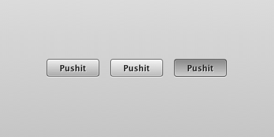
And looks like this:

States: Nor­mal, Hover/Focus, Active (left to right)

Well, it looks that way in Fire­fox (3.6+), Safari & Chrome. I haven’t even test­ed in IE and don’t care to. I’m sure that it’d be pos­si­ble to do this in with prop­er pro­gres­sive enhance­ment, but this was about test­ing the bound­aries of CSS3.

I’m not going to break down the code here. That’s what Firebug/Inspector/View Source are for. But here are some notes:

  • The biggest weak­ness by far is that I need­ed to set an explic­it width on the but­tons. (Fixed) I could­n’t find a way around this and main­tain my no-extra-markup chal­lenge. Con­sis­tent widths might actu­al­ly be an advan­tage in cer­tain con­texts. (There are some class­es to pro­vide for dif­fer­ent widths.)
  • CSS3 gra­di­ents galore. Not an image in sight.
  • The extra bor­ders are cre­at­ed using :after and :before pseudo-elements.
  • The CSS3 gra­di­ents use rgba col­or nota­tion with alpha val­ues so that you can have dif­fer­ent coloured but­tons by chang­ing only the back­ground-col­or. (I assigned a few colour exam­ples to extra classes)
  • Real <input type="submit" /> but­tons don’t allow :after and :before pseu­do-ele­ments. Form ele­ments are weird.
  • CSS gra­di­ents are cur­rent­ly avoid­ed by ‑webkit/-moz-tran­si­tion. Brief googling indi­cat­ed per­for­mance con­cerns. If you want­ed the ooh shiny™, you could change the background-color on the :hover/:active states instead. I avoid­ed this because I only want­ed to have to declare a sin­gle background-color for col­or class­es, but tried it in the obvi­ous­ly-labeled button.

Tired of read­ing? Look at some real­is­tic look­ing CSS3(-only) but­tons. And if any­one has any ideas about how to over­come the fixed-width require­ment, do share!

The Erudite 2.5 Released

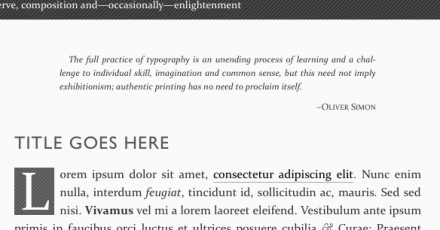
The Eru­dite 2.5 has been released, with a cou­ple of real­ly nice new fea­tures. I had a request to include epigraphs in the theme, which per­fect­ly match­es The Eru­dite’s empha­sis on typog­ra­phy and con­tent. Have a look at the image or check the demo site:

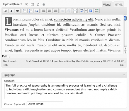
I also learned this month from WP core team mem­ber Andrew Ozz that it’s pos­si­ble to style the visu­al edi­tor. Now you’ll have a much bet­ter idea of how your prose will look before you press Publish:

You’ll also note above how easy it is to add an epi­graph to your posts.

Final­ly, thanks to Den­nis Meu­len­steen for pro­vid­ing a Dutch trans­la­tion. If you have a trans­la­tion you’d like to con­tribute back to The Eru­dite, let me know in the com­ments or get in touch.

To down­load, go to the WP Themes Direc­to­ry or, if 2.5 isn’t avail­able there yet, to the project page.

On the iPad and Web Design

As usu­al, Apple’s newest cre­ation has pro­duced opin­ions. The rhetoric of those for and against it is pre­dictably strong and, occa­sion­al­ly, ridicu­lous. I don’t care to add my voice to the din. My atten­tion is more fix­at­ed on the fact that if the iPad is suc­cess­ful, we’ll have to say good­bye to a whole host of assump­tions as we say “hel­lo” to a new era of touch com­put­ing. What does this mean for web designers?
Goodbye Mouse, Hello Hands

How much of your site depends on mouse hov­er states? Hope­ful­ly none, if you’re com­mit­ted to acces­si­bil­i­ty. But, chances are there are parts that labour under the assump­tion that every­one is—and always will be—using a mouse. If touch com­put­ing replaces the mouse + key­board par­a­digm that’s dom­i­nant today, there’s going to be a lot of scur­ry­ing to retro­fit web­sites to be usable by folks get­ting their hands on your site. I know that I’m not going to make any­thing rely on mouse hov­er states from here on out.

But that’s mere­ly a tech­ni­cal hur­dle. There’s a fun­da­men­tal dif­fer­ence between an inter­ac­tion with your screen medi­at­ed by a mouse and reach­ing out and touch­ing some­thing. Your web­site will no longer have clicks; it will have users touch­ing, pinch­ing, swip­ing, rotat­ing. In short, the touch expe­ri­ence is flush with poten­tial for a rich­er, more tex­tured inter­ac­tion par­a­digm in our web­sites. Touch might be as large a par­a­digm shift beyond today’s web as the web has been over print.

Goodbye Landscape, Hello Portrait

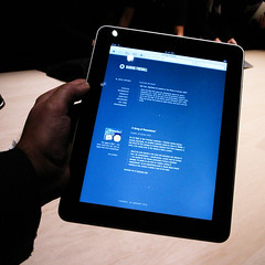
Gruber viewing Daring Fireball in the iPadCom­put­er mon­i­tors have always had a land­scape ori­en­ta­tion. This has only become more promi­nent in recent years as we moved from ubiq­ui­tous 4:3 ratios to var­i­ous widescreen for­mats. In short, we’ve had ample width and short heights. (Thus the reli­gious wars over “the fold.”)

But here we have a 3:4 ori­en­ta­tion. Por­trait. Does por­trait encour­age ver­ti­cal scan­ning instead of hor­i­zon­tal? What does it mean to relax about how high on the page our cen­tral con­tent is? How many assump­tions about how the web works do we have that are based on the land­scape orientation?

You might wish to inform me that the screen can just as eas­i­ly be used in land­scape, but my mon­ey’s on peo­ple using it in por­trait more often than not. But even that abil­i­ty to choose has big impli­ca­tions for our assump­tions about design­ing for the web.

Goodbye Flash, Hello Web Standards

Vir­tu­al ink is being spilled with aban­don over the iPad and Flash sup­port. Flash gained trac­tion because web stan­dards were defi­cient in 2 core areas: video and ani­ma­tion. HTML5 has the video ele­ment, and ani­ma­tion via can­vas, SVG, CSS ani­ma­tions, and plain ol’ JavaScript can do 98% of the things that Flash is cur­rent­ly used for.

More impor­tant­ly, web stan­dards can do 100% of the desir­able things that Flash can do. Those tech­nolo­gies aren’t yet sup­port­ed by every brows­er, but they are sup­port­ed by Safari, and that’s all that mat­ters here. And are you real­ly going to miss those punch a mon­key ban­ner ads?

The two things pre­vent­ing Flash’s demise are 1) momen­tum and 2) author­ing tools. The for­mer is shift­ing thanks to the iPhone and iPad, and the lat­ter is bound to change.

Goodbye Fringe, Hello Mainstream

Brows­ing on the iPhone can be frus­trat­ing when the con­tent you’re look­ing for is all Flash. Oth­er times the site has sim­ply been over­ly opti­mized for the desk­top and/or Inter­net Explor­er. Some may blame the device, but as the iPhone con­tin­ues to grow and the iPad emerges, it’ll be busi­ness sui­cide to have a poor expe­ri­ence in the mobile sec­tor. Let’s face it — users with enough mon­ey to spend on an iPhone and/or an iPad are exact­ly the types of peo­ple that most busi­ness­es want to appeal to.

In short, web design­ers who under­stand how to design good web expe­ri­ences for these plat­forms will only become more sought after. And this just might allow me to jus­ti­fy an iPad as a busi­ness expense.

Quix Bookmarklet

Here’s some­thing pret­ty cool — a meta-book­marklet called Quix.app by Joost de Valk. It gives you access to dozens of func­tions and book­marklets in one con­tain­er. Invoke the book­marklet and type, for instance, “gs where do babies come from” to run a Google search on the cur­rent site you’re view­ing.

There are oodles of good­ies in there for web devel­op­ers, and Word­Press folks. And I might com­mend Joost­’s good taste in includ­ing Font­Friend in Quix — just type “font” and you’re off.

Subsetted Fallback Fonts

I recent­ly launched thatwasnotok.com, a humourous take on how to han­dle social un-graces. One of the fun parts of design­ing and build­ing the site was the free­dom to work with a font like Chunk with­out resort­ing to embed­ding it in images or using sIFR or Cufon. I showed it to Tim Brown from Nice Web Type, prompt­ing a dia­logue about some deci­sions I made in work­ing with Chunk, which Tim lat­er pub­lished. (Inci­den­tal­ly, if you’re curi­ous about how to embed fonts in a web page, Tim’s How to use CSS @font-face is your best start­ing point.)

But what I real­ly want to talk about was one of the ques­tions Tim asked me but chose not to pub­lish on his site, which was:

So about the miss­ing char­ac­ters in Chunk. What if you did­n’t have an alter­na­tive (like if you need­ed an amper­sand)? Would you sub­sti­tute one from anoth­er type­face? Which typeface?

After men­tion­ing that I did­n’t much care about the miss­ing glyphs for such a small site as mine, I went on to say:

For a font with glyphs miss­ing, you fall back in your CSS stack to the next font that has the glyph. This is the premise that Type­kit works on when it splits fonts into two pieces and then puts some­thing like font-family: skolar-1, skolar-2, serif; in its CSS rules. If I had found a com­pli­men­ta­ry type­face (with appro­pri­ate licens­ing) and want­ed it just for the glyphs that Chunk was miss­ing, I could make a small, sub­set­ted ver­sion of it (remove all the glyphs that Chunk already has), embed it as well with @font-face and put it after Chunk in the font stack.

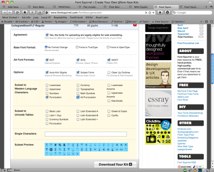
After my chat with Tim, I became a lit­tle fix­at­ed on try­ing to find just such a suit­able sub­set­ted fall­back. I went over to Font Squir­rel and came up with two pos­si­ble free replace­ments: Col­le­giate­FLF Black and Ben­der Black. After down­load­ing, I re-uploaded them through Font Squir­rel’s mar­velous @font-face Gen­er­a­tor in order to sub­set the fonts down to only glyphs that aren’t already in Chunk (more or less). Sub­set­ting only the glyphs you need can cre­ate dra­mat­i­cal­ly small­er font files, speed­ing up your site. I chose to only include Punc­tu­a­tion and Alt Punc­tu­a­tion, as shown in the image below (click for larger):

subsetting

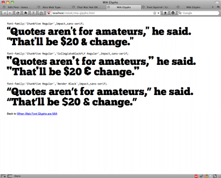
So, what did it look like? Not that great unfor­tu­nate­ly. Chunk is just far too unique to play well with (freely avail­able) oth­ers. I tried three dif­fer­ent stacks, falling back to either 1) Impact, 2) Col­le­giate Black and 3) Ben­der Black. Have a look: MIA Glyphs, or just see the image below.

stack-experiments

I think that Col­le­giate Black comes the clos­est, but its dol­lar sign and amper­sand are a ter­ri­ble match for Chunk. Ben­der is entire­ly ill-suit­ed, and Impact isn’t much bet­ter. None of the apos­tro­phes look sim­i­lar to Chunk’s com­ma, which is what I would hope to see in a well-suit­ed fallback.

The clos­est I came to being hap­py was with Impact as a fall­back for apos­tro­phes (the only glyph I need­ed that Chunk lacked). I cre­at­ed a ver­sion of thatwasnotok.com that used a pseu­do-bold Impact for apos­tro­phes where they were called for: Impact apos­tro­phes. I also had to sur­round the apos­tro­phes in a span ele­ment to nudge them into place.

I hope that this some­what fruit­less exer­cise was of inter­est to peo­ple try­ing to make  fonts work on the web. Many of the free fonts that allow @font-face embed­ding suf­fer from absent glyphs, so using a sub­set­ted fall­back may be a life­saver for you. As for me, I’m still not sure if I’ll push the Impact apos­tro­phe’d ver­sion live or keep the ver­sion with primes. Any­one have an opinion?