UPDATE: I published Realistic CSS3 Buttons Redux to make even better buttons.
A while back Mike Rundle posted the terrific article Crafting Subtle & Realistic User Interfaces. He clearly articulates design details which make buttons look realistic and therefore push-able. If you haven’t read it, go there, spend lots of time looking at his excellent diagrams, and then come back. Go even if you forget to come back.
Then Jay on the Inference blog shared his CSS3 implementation of Rundle’s buttons to great effect. He also explicitly shows the design details (with excellent diagrams) that make for press-able buttons. But, sadly, there was very little “3” in the CSS3, only making use of border-radius and rgba colors. Also, he resorted to 3 layers of nested <b> elements inside the <a> elements to implement his effect. I knew that this could be done with leaner markup, more CSS3 goodies, zero images, and way more flexibility. (Note: this isn’t a critique of Jay’s good work — just an instance where someone inspires you to try to do better.)
The end result uses markup that looks like this:
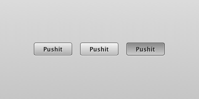
<a href="#" class="button">Pushit</a>And looks like this:

States: Normal, Hover/Focus, Active (left to right)
Well, it looks that way in Firefox (3.6+), Safari & Chrome. I haven’t even tested in IE and don’t care to. I’m sure that it’d be possible to do this in with proper progressive enhancement, but this was about testing the boundaries of CSS3.
I’m not going to break down the code here. That’s what Firebug/Inspector/View Source are for. But here are some notes:
- The biggest weakness by far is that I needed to set an explicit width on the buttons. (Fixed) I couldn’t find a way around this and maintain my no-extra-markup challenge. Consistent widths might actually be an advantage in certain contexts. (There are some classes to provide for different widths.)
- CSS3 gradients galore. Not an image in sight.
- The extra borders are created using
:afterand:beforepseudo-elements. - The CSS3 gradients use rgba color notation with alpha values so that you can have different coloured buttons by changing only the background-color. (I assigned a few colour examples to extra classes)
- Real
<input type="submit" />buttons don’t allow:afterand:beforepseudo-elements. Form elements are weird. - CSS gradients are currently avoided by ‑webkit/-moz-transition. Brief googling indicated performance concerns. If you wanted the ooh shiny™, you could change the
background-coloron the:hover/:activestates instead. I avoided this because I only wanted to have to declare a singlebackground-colorfor color classes, but tried it in the obviously-labeled button.
Tired of reading? Look at some realistic looking CSS3(-only) buttons. And if anyone has any ideas about how to overcome the fixed-width requirement, do share!
12 Comments
Excellent, I really like how you implemented the emboss effect using :after and :before. Never seen that technique used to create borders before, very nice!
Thanks Bryan. The :before and :after pseudo-elements are sadly underused due to no support in IE6 & 7.
In this case the buttons would still work fine, they just wouldn’t have the nice extra borders.
I saw your post on Dribbble, but since I don’t have an account I couldn’t comment there.. but fortunately I can here!
First off, you might consider taking a look at some CSS3 buttons I made a few days ago: http://experiments.brandoncash.net/sexybuttons/
A couple of things you might consider:
Drop :before and :after altogether and just use inset box shadows. For this you can use ‑webkit-box-shadow, ‑moz-box-shadow, and box-shadow.
Check out <button /> instead of <input type=“submit” />, as :before and :after work there. The reason they don’t work on s is because they don’t really have content, just the value.
Let me know if that helps you solve the problems you were having!
@Brandon Good work on those buttons! As for using inset box shadows, there were two reasons not to: 1) last I’d heard that inset wasn’t supported in webkit, but that appears to have changed. 2) inset box-shadow doesn’t give that nice solid 1px edge all the way around that I wanted.
You’re right that <button> supports :after and :before (good catch), but it still comes out badly due to the inherent issues with styling form elements. (See link in post).
BUT, inset box-shadow would make for a much nicer depressed state I think. I might have to try a new revision with those.
(PS fixed your missing html and deleted your comment about it.)
There is still a bug (http://code.google.com/p/chromium/issues/detail?id=25334) that prevents the inset box shadows from being drawn correctly in Webkit, but that really only affects the buttons with a large border-radius (the larger the radius, the more of the background shows through).
As for getting a sharp border all the way around, consider something like ‑webkit-box-shadow: white 0px 0px 2px inset;
There’s still a lot of room for improvement on CSS3, but I’m looking forward to the features we’ll see in the coming months!
Your link to ” realistic looking CSS3(-only) buttons” leads to a dead end. Is it up, or is the URL mal-formed? Thanks!
@Lola Thanks, the link works again. I moved some things around over the weekend and this was forgotten.
I had previously created the Cadmus post button in Photoshop and it was essentially three images for the different states. I wanted to use this style for all.
i like your way of teaching it forces guys to actually read and follow whats going on, as opposed to copy pasting — lol.
Quite nice buttons and tutorial.
Although, you probably should have added a space (after the “h” and definitely not before the “s”) in the button text… !!
Hey, I faced the same fixed width problem a lot of times. I just wanted to let you know that I have successfully used jQuery in some cases and got around this problem! 🙂
I am customizing some “read more” buttons and this post provided some great insight.
Many thanks,
Richard
4 Trackbacks