That Was Not OK

The Idea

Have you ever found your­self in a social set­ting where some­one’s inad­e­quate social skills cause con­ster­na­tion to every­one around them? Of course you have. Have you ever wished there was a way to dis­creet­ly tell them that their behav­iour is not OK?

Now you can. That Was Not OK is here to help. Print the cards, and keep them in your wal­let for just just such situations.

The Design

For the web nerds out there, this turned out to be a fun show­case for what can be done with native font embed­ding via @font-face. Thanks to Jonathan Snook, Paul Irish and Font Squir­rel for their ter­rif­ic work in tak­ing font embed­ding from a new and untest­ed tech­nol­o­gy to an increas­ing­ly viable tool in the web design toolbelt.

For the embed­ded font, I turned to The League of Move­able Type’s brash Chunk, an ultra-bold slab serif that helped the typog­ra­phy shout at you. (If the font were less intim­i­dat­ing, I’d ask it why it’s miss­ing an amper­sand and smart quotes.) I found that the all-caps main title need­ed some seri­ous kern­ing, but I’m real­ly hap­py with the end product.

The Erudite 2.0 Released

I’ve released v2.0 of The Eru­dite, which has 2 oft-request­ed fea­tures in it:

  1. A dark theme option
  2. An option to use cat­e­gories instead of pages for the top menu

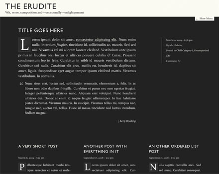
I fig­ured throw­ing in a whole new col­or scheme jus­ti­fied a 2.0 des­ig­na­tion. Although I still like the orig­i­nal col­or scheme the best, the new one has its appeals:

erudite-dark

Head on over to the project page to down­load it! (It’ll also be on the WordPress.org themes repos­i­to­ry soon)

That Delicious @font-face

As of a cou­ple of min­utes ago, this site has rel­e­gat­ed the ven­er­a­ble sIFR to the dust­bin of his­to­ry, opt­ing instead for the bright future of true cus­tom fonts using the @font-face CSS dec­la­ra­tion that has been around since 1998.

font-face-vs-sifr2

Why it took so long for cus­tom web fonts to become an in-brows­er real­i­ty is a tan­gled tale involv­ing brows­er wars, font foundry fears and a gen­er­al iner­tia of rest. Many thorny licens­ing issues remain regard­ing the use of com­mer­cial fonts on the web, which is why there’s been a pro­lif­er­a­tion of third-par­ty solu­tions such as Type­Kit, Font­deck and Kernest crop­ping up.

But there are also headache-free choic­es such as the excel­lent free fonts from Jos Buiv­en­ga’s exljbris Font Foundry. Since Jos explic­it­ly allows @font-face embed­ding, this site uses his excel­lent Deli­cious font for menus and head­ings, and will run smoother and faster than ever thanks to ditch­ing sIFR’s Flash dependency.

Not all is sun­shine and ros­es. The iPhone ver­sion of Safari has dis­abled @font-face link­ing for some rea­son unknown to me. IE has its own pro­pri­etary for­mat that involves acronyms like EOT and WEFT, along­side a high prob­a­bil­i­ty of ani­mal sac­ri­fice to appease the demons who designed WEFT. But there is a light at the end of tun­nel, and we’ve stepped through it.

The Erudite 1.4 Released

I’ve bumped The Eru­dite to ver­sion 1.4 today. This release adds the abil­i­ty to turn off the dynam­ic head­er and foot­er, and adds a few small typo­graph­ic fix­es sur­round­ing the dis­play of nest­ed lists.

You can down­load this release over at the project page, or from the WP.org themes direc­to­ry when­ev­er they update it.

FontFriend 1.0 Released

I haven’t giv­en Font­Friend much atten­tion since it was released, but I put­tered around with it a bit over the week­end and fig­ured that it deserves a prop­er 1.0 release now. If you’re already using the book­marklet, you’re run­ning the lat­est and great­est automatically.

Fea­tures added in 1.0 include:

  • a field for a cus­tom font (you’re not restrict­ed to my extreme­ly well-though out list)
  • a but­ton to reset all styles (also handy for pages with loads of inline styles!)
  • default selec­tor is body rather than h1,h2,h3

I haven’t received any reports of bugs, because I’m so awe­some. Well, I did add a bit more defen­sive CSS to deal with over­lap­ping site styles. And, if my awe­some­ness has dimmed and a bug has crept in, let me know in the com­ments. And if you missed the link above, go to Font­Friend’s project page for full details