Web Standards and IE 8 Part 2

The IE team has just announced on their blog that IE8 will default to their lat­est and great­est stan­dards mode, in an about-face from their pre­vi­ous stance that IE8 would default to IE7’s ren­der­ing mode, which I cov­ered when it was first announced. Their pre­vi­ous pro­pos­al would have required devel­op­ers to insert an opt-in meta tag (or http head­er) in order to obtain IE8’s ren­der­ing mode, leav­ing the thou­sands of sites that tar­get IE7’s var­i­ous mis-han­dled stan­dards imple­men­ta­tions none the wiser.

I applaud the IE team for lis­ten­ing to devel­op­er feed­back. Although I defend­ed their pre­vi­ous pro­pos­al and tried to make the best of it, I’m much hap­pi­er about this. Web stan­dards and good devel­op­ment prac­tices will receive anoth­er boost, as peo­ple will be scream­ing bloody mur­der at their bro­ken sites. Devel­op­ers will be point­ed to the meta tag and essen­tial­ly told, “we’re mov­ing ahead on the web, but we had pity on your 5‑year old prac­tices and decid­ed to let you play too.” Design­ers who don’t know a table from a div will either be forced to learn about (X)HTML, CSS, and JavaScript, or be forced fur­ther into irrel­e­vance and obscurity.

IE team, I salute you. You will, undoubt­ed­ly, have a lot of igno­rant and incom­pe­tent devel­op­ers and design­ers froth­ing at the mouth when IE8 releas­es, but you made the right move.

Whitespace Primer

I was recent­ly asked by a client to cri­tique a half-imple­ment­ed site as an out­side set of eyes. One thing I noticed in the stock-lay­out being used was a hor­ri­ble use of white­space, so I blithe­ly includ­ed in my cri­tique that the use of white­space was, well, terrible.

The client asked the obvi­ous ques­tion: what is white­space? I had fall­en prey to a car­di­nal sin: assum­ing that my client knows insid­er jar­gon. Ter­ri­ble com­mu­ni­ca­tion on my part, and I hope to do bet­ter in the future! I searched for some intro­duc­to­ry arti­cles regard­ing white­space to send him to, but the best one I found at A List Apart was by a design­er for design­ers, and still used too much design jar­gon. So, here’s an attempt to sim­ply spell out white­space, 99.9% jargon-free.

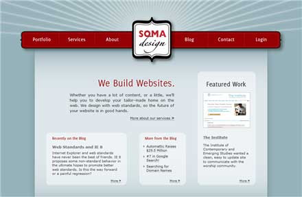
While the aver­age per­son has no idea what white­space is, it impacts them sub­con­scious­ly when look­ing at a design. If a design looks “relaxed,” then it’s mak­ing good use of white­space, while a “busy” design is usu­al­ly mak­ing poor use of white­space. White­space is, quite sim­ply, the emp­ty or neg­a­tive space that sep­a­rates dif­fer­ent things on a page. It might not be exact­ly white in col­or, it will sim­ply be what­ev­er col­or makes up the back­ground. Let’s have a look at some pic­tures, which I’ll use from my home page. Below is an image of my home page, which looks fair­ly relaxed:

home page screenshot

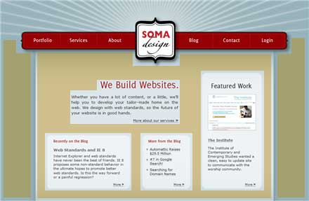
It looks relaxed because I made gen­er­ous use of white­space, which I have high­light­ed below:

home page screenshot - highlighted whitespace

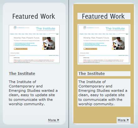
If it weren’t for this white­space, the con­tent would just be a chaot­ic pile of goo. White­space also applies to small­er areas, such as inside one of the box­es on my home page:

whitespace in a box

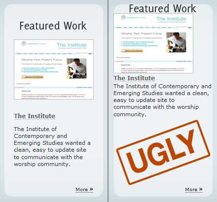
And final­ly, to demon­strate the neces­si­ty of white­space, here’s my box as it appears on the home­page, and one with­out whitespace:

bad whitespace in a box

While the one on the right is a bit extreme, you get the point! The big trade-off when it comes to white­space is that it does­n’t allow you to fit as much con­tent into the same sized space as you oth­er­wise would be able to. This actu­al­ly turns out to be a good thing as it forces you to keep focused on what your site needs to say, while throw­ing out what all those lit­tle things that you could say that will only dilute your mes­sage. Hope­ful­ly that was help­ful to someone!

(Dis­claimer to any “true design­er” who is read­ing this: yes, I know I did­n’t say every­thing, that’s the point.)

Web Standards and IE 8

There’s trou­ble brew­ing in the web world over Inter­net Explor­er 8 and web stan­dards. For an intro­duc­tion to what the fuss is about, go to A List Apart’s issue #251 and read both articles.
The ensu­ing back­lash has been large and heat­ed. Dig­i­tal Web has col­lect­ed some of the reac­tions.

Here’s my take on things: it’s a mixed bag. It’s an imper­fect solu­tion to a hor­ren­dous prob­lem. Inter­net Explor­er has the dis­tinc­tion of being the ubiq­ui­tous brows­er on the web, while hav­ing the worst web stan­dards sup­port of any brows­er. It’s a catch-22: if IE’s devel­op­ers push for qual­i­ty web stan­dards sup­port in IE 8 (which, by all accounts they are), they will break the many sites out there that were not designed with web stan­dards in mind. Let’s face it: a lot of the web is built only for IE, and peo­ple will be con­fused and out­raged if IE 8 breaks their poor­ly built–but functional–sites. On the oth­er hand, focus­ing too much on keep­ing exist­ing sites work­ing will ensure that IE 8 con­tin­ues to lag far behind in its sup­port for web standards.

So, ver­sion tar­get­ing is an imper­fect solu­tion to an imper­fect web. I wish that it was­n’t nec­es­sary, but I know that I’ll be using it right along­side my con­di­tion­al com­ments and CSS hacks to design sites built on web stan­dards that work in all the major browsers, even if I have to kick the crap out of IE to make it coop­er­ate. Maybe I’ll only have to ask it now.

Automattic Raises $29.5 Million

Automat­tic, the fast-grow­ing com­pa­ny behind the pop­u­lar Word­Press blog­ging soft­ware (heav­i­ly endorsed by Soma Design) and the free WordPress.com blog­ging ser­vice, just announced a $29.5 mil­lion round of fund­ing.

One of the fas­ci­nat­ing things is that the NY Times, that bas­tion of old media, was one of the investors. This makes total sense once you look a lit­tle deep­er and real­ize that the NY Times are using Word­Press to pow­er their ever-expand­ing col­lec­tion of blogs.

What this means is that Word­Press has a long, bright future ahead of it with the peo­ple who loved it before they had any idea that they could make mon­ey off it still right in the thick of things and get­ting paid well to boot. It means that small web design shops like ours can expect Word­Press to con­tin­ue being a ter­rif­ic and evolv­ing plat­form upon which to build web­sites (like this one) for years to come.

On more per­son­al note, I must extend a hearty con­grat­u­la­tions to Matt and the team at Automat­tic for being reward­ed for their ter­rif­ic work. Good job!

#7 in Google Search!

After a mere week online, Soma Design now shows up on the front page of a Google search for soma design. We’re doing even bet­ter on google.ca, where we cur­rent­ly come up as #2. (We come up as #1 if you restrict the search to cana­da only.)

While there are numer­ous oth­er orga­ni­za­tions out there with some vari­a­tion on the moniker “soma design,” we felt that the world was big enough for anoth­er one. Also, since somadesign.ca was still avail­able, we decid­ed that there was def­i­nite­ly room in Cana­da for us. It’s a big country!

As for the name, why did we choose it? It’s short, catchy, easy to remem­ber and hard to spell wrong. It also allows me to indulge my nerdy side, as it’s a greek word that trans­lates to body. Body con­jures up asso­ci­a­tions of organ­ic, uni­ty in diver­si­ty, sim­plic­i­ty in com­plex­i­ty and a flair for sen­si­ble (yet quirky) design that I hope will per­vade all that we do here.