I was recently asked by a client to critique a half-implemented site as an outside set of eyes. One thing I noticed in the stock-layout being used was a horrible use of whitespace, so I blithely included in my critique that the use of whitespace was, well, terrible.
The client asked the obvious question: what is whitespace? I had fallen prey to a cardinal sin: assuming that my client knows insider jargon. Terrible communication on my part, and I hope to do better in the future! I searched for some introductory articles regarding whitespace to send him to, but the best one I found at A List Apart was by a designer for designers, and still used too much design jargon. So, here’s an attempt to simply spell out whitespace, 99.9% jargon-free.
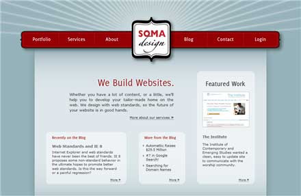
While the average person has no idea what whitespace is, it impacts them subconsciously when looking at a design. If a design looks “relaxed,” then it’s making good use of whitespace, while a “busy” design is usually making poor use of whitespace. Whitespace is, quite simply, the empty or negative space that separates different things on a page. It might not be exactly white in color, it will simply be whatever color makes up the background. Let’s have a look at some pictures, which I’ll use from my home page. Below is an image of my home page, which looks fairly relaxed:
It looks relaxed because I made generous use of whitespace, which I have highlighted below:
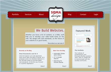
If it weren’t for this whitespace, the content would just be a chaotic pile of goo. Whitespace also applies to smaller areas, such as inside one of the boxes on my home page:
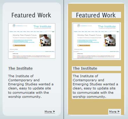
And finally, to demonstrate the necessity of whitespace, here’s my box as it appears on the homepage, and one without whitespace:
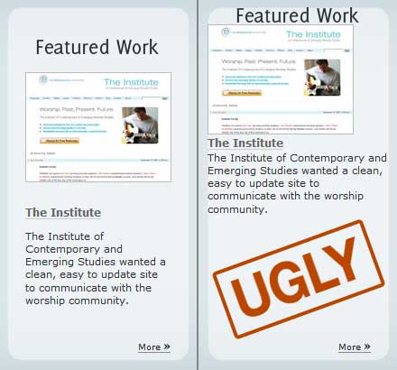
While the one on the right is a bit extreme, you get the point! The big trade-off when it comes to whitespace is that it doesn’t allow you to fit as much content into the same sized space as you otherwise would be able to. This actually turns out to be a good thing as it forces you to keep focused on what your site needs to say, while throwing out what all those little things that you could say that will only dilute your message. Hopefully that was helpful to someone!
(Disclaimer to any “true designer” who is reading this: yes, I know I didn’t say everything, that’s the point.)
One Trackback